hank + joan's
brand strategy
brand identity
web & digital design
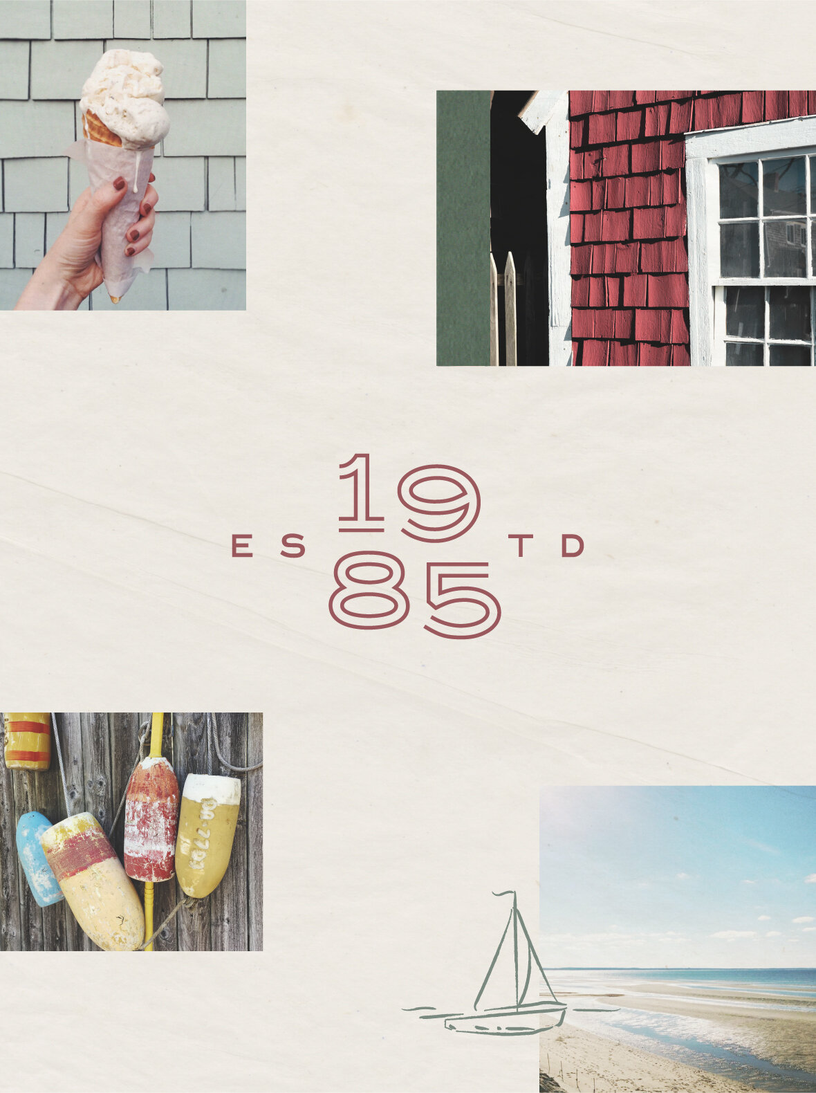
Hank + Joan’s is a quaint, small haven of homey cottages on the bayside of Cape Cod, Massachusetts. After years of word-of-mouth referrals, Joan and her family wanted to open their property to new eyes, while maintaining the simplicity and nostalgia that keeps vacationers coming back year after year.

The Hank + Joan’s primary logo uses handwriting reminiscent to welcome notes Joan would write her guests—it’s personal, nostalgic, and homey.

“OK BY ME”
Hank always loved sailing, and since retiring near the ocean, he knew a sailboat was in his future. Hank went “window shopping” one afternoon, and shortly after Joan got call saying, “Honey, I found a boat! Can I buy it?” and Joan replied, “Ok by me!”. And the sailboat was so christened, Ok By Me. Now, the phrase speaks to the laid back, optimistic outlook that Hank and Joan foster for their guests.


The color palette is pulled directly from the H+J home—Cape Cod. The hues are soft and muted, grounded in nature, and remind us of simpler times vacationing with family.


The handdrawn “illustricons” mimic the logo style, and are used on every asset imaginable—from patterns, to social posts, to H+J swag. Each cottage was also illustrated and given it’s own nautical-themed name.


